Henry Keazor:
«Baroque irony, as sophisticated as Pop»: Auseinandersetzungen mit dem Barock in der Gegenwartskunst
[«Baroque irony, as sophisticated as Pop»: Dialogues with the Baroque in contemporary art]
Electronically reproduced offprint from
Barock – Moderne – Postmoderne:ungeklärte Beziehungen
[Baroque – Modernism – Postmodernism: unsettled relationships] edited by Victoria von Flemming and Alma-Elisa Kittner in Wolfenbütteler Arbeiten zur Baroqueforschung Vol. 50 (pages 261-287; colour reproductions pp. 348-349).
Translation into english authorized by thr author for joancosta.net
Published by Harrassowitz Verlag, Wiesbaden 2014 / www.harrassowitz-verlag.de
ISBN 978-3-447-10019-9 / ISSN 0724-472X
Cover design incorporating Joan Costa, Veronica Taylor in Red (2003), © Fundació Martinez Guerricabeitia, València (Spain).
Bibliographic information published by the Deutsche Nationalbibliothek. Deutsche Nationalbibliothek lists this publication in the Deutsche Nationalbibliografie; detailed bibliographic data are available on the internet at http://dnb.dnb.de

As far back as 1935 the German scholar Paul Hankamer described «Baroque irony» (*Note-1) as a «fundamental tendency of the era» and identified the source that sustained the «irony» that he had diagnosed as the tension that exists between life, sensual and therefore ephemeral, and the spirit, which challenges the parameters of life, desire and death, and ultimately overcomes them as it artfully plays with them. Hankamer’s most important reference in this regard is Daniel Caspar von Lohenstein’s novel «Großmütig Feldherr Arminius oder Hermann» [«The Noble General Arminius or Hermann»] (*Note-2) (1689/1690), in which, as he writes, «the serious intent of the great work of art can hardly be less in doubt for us than it is in those moving poems – sonnets in particular – in which a deliberate «ironic» punchline once again and with particular clarity emphasises that it is art, when the human spirit is playing with the things of life» (*Note-3) .
«To play with things» (even when another motive may be involved) and so «to signify art» is an practice embraced since the 1970s by the Postmodernist movement in architecture, whose identifying features tend to demonstrate parallels with those that are often used to define the Baroque era.
Theodor W. Adorno’s description of the Baroque as «decorazione assoluta» – absolute decoration – can be applied to many representative examples of Postmodernist architecture. Adorno wrote that, «To say that the Baroque is decorative is not enough. It is decorazione assoluta, decoration that has emancipated itself from all function […] and evolved a set of formal rules of its own. It has ceased to be decorative of something, it is decoration to the exclusion of all else […]» (*Note-4) .
This definition is particularly applicable in the case of a typical piece of Postmodernist architecture, Charles Moore’s «Piazza d’Italia» in New Orleans, Louisiana,
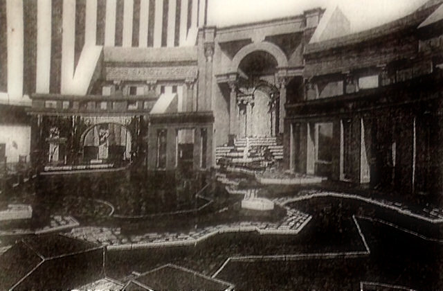
Plate 1: Charles Moore, Piazza d’Italia (1976-1979), New Orleans.
built between 1976 and 1979 as a public sector commission comprising a piazza with fountain, in which ornament and function, architectural purpose and architectural decoration, have become impossible to separate out from one another (*Note-5). Moore’s Piazza d’Italia was intended in the first place to highlight the important contribution of the city’s Italian community to the cultural diversity of New Orleans, long overshadowed by the city’s celebration of the contribution of its other ethnic communities – the French, the Spanish and the Afro-Americans. The message is spelled out in the Latin text inscribed on the entablature «Hunc fontem cives Novi Aureliani toto populo dono dederunt» – «This fountain is a gift from the citizens of New Orleans to all of its residents.»
NOTES AND REFERENCES PAGE 1
1 – HANKAMER, Paul, Deutsche Gegenreformation und deutsches Baroque. Stuttgart 1935, p. 174: «[…] an underlying tendency of the era […]: Baroque irony».
2 – VON LOHENSTEIN, Daniel Caspar, Grossmüthiger Feldherr Arminius oder Hermann/ Als ein tapfferer Beschirmer der deutschen Freyheit/ Nebst seiner durchlauchtigen Thussnelda/ Jn einer sinnreichen Staats- Liebes- und Helden-Geschichte/ Dem Vaterlande zu Liebe/ Dem deutschen Adel aber zu Ehren und rühmlichen Nachfolge/ Jn Zwey Theilen vorgestellet, Leipzig 1689 -1690.
3 – HANKAMER, Deutsche Gegenreformation (as Note 1), p. 437.
4 – ADORNO, Theodor W., Ästhetische Theorie. Gesammelte Schriften 7. Frankfurt am Main 1970, p. 437.
5 – On the subject of Moore’s Piazza d’Italia see DOUGLAS, Lake, Piazza d’Italia. in Architectural Review, Vol. CLXV, No. 987 (1979), p. 255 et seq.; KLOTZ, Heinrich , Moderne und Postmoderne. Architektur der Gegenwart, 1960-1980. Braunschweig and Wiesbaden 1984, pp. 137-140; JOHNSON, Eugene J., Charles Moore: Bauten und Projekte 1949 -1986, Stuttgart 1987, p. 78 et seq.; and JENCKS, Charles, Die Sprache der postmodernen Architektur. Stuttgart 1988, p. 146.
The complex was also intended to function as a public meeting place and general leisure space and in this way – its third purpose – to serve as a counterpoint to the increasing number of demolished properties in the central business district of New Orleans and signal the district’s regeneration.
Moore’s design does more than just acknowledge these aims and purposes, it makes them so much an integral part of it that they have become inseparable from the project’s visual appearance. As an example, the anticipated «regeneration» of the district is articulated by the life-giving waters of St. Joseph’s Fountain spilling forth from the various jets of the fountain that serves as the centrepiece and focus of the site.
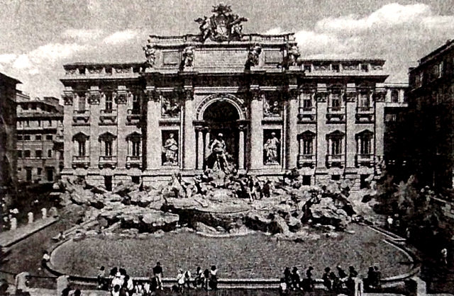
Plate 2: Nicola Salvi, Fontana di Trevi (1732-1762), Rome
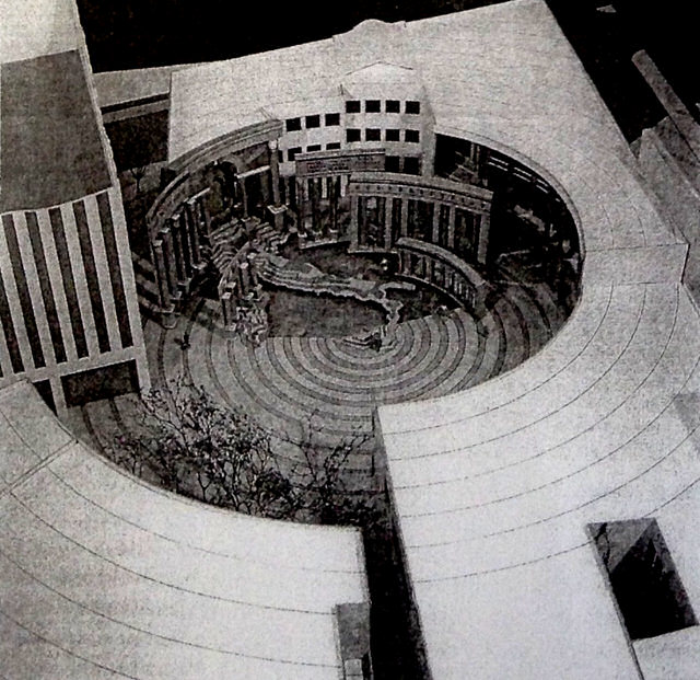
The reference to the Roman Baroque – Moore’s «Piazza» makes no secret of its relationship to the Fontana di Trevi and its ample basin is continued in the different types of classical decorative architecture present, the five historical orders of Roman antiquity and the Italian Renaissance (Tuscan, Doric, Ionic, Corinthian and Composite) also referencing the presence immediately nearby of the American Italian Renaissance Foundation’s Museum and Library. Finally the Italian connection is picked up once again in the overhead view, showing how the various platforms and steps of the fountain combine to create the «boot» of Italy.

Plate 3: Charles Moore, Piazza d’Italia (1976), model (Arkitekturmuseum, Frankfurt am Main).
However these architectural features show no attempt at any historically accurate referencing of style. Instead they visually updated through the use of contemporary materials like steel and neon and the resulting ironic adaptation and transformation of traditional features. Out of the encounter between water and architecture Moore creates novel formal elements including Doric and Tuscan pillars of water (*Note-6) and so-called «wetopes» («wet» metopes) – not formed by painted or sculpted slabs of stone as elsewhere but empty spaces that conical sprays fill with little jets of water directed from below.
Just as the playfulness of the «wetopes» is not something that will necessarily be appreciated by every visitor, there are other ironic details that will not be immediately obvious or intelligible to everyone. Not everyone will notice that the spouts out of which the waters of the fountain emerge are made in the image of Charles Moore himself and only a few people will learn that the name of the piece and some of its elements, for example, the flat, theatrical arches and the colour scheme, are from Giorgio de Chirico’s painting Piazza d’Italia…
NOTES AND REFERENCES PAGE 2
6 – A metal ring serving as a capital has fine nozzles set into the outer rim from which water pours down in such a way that, by adjusting the flow control settings, the outer surface of the water takes on a plain or a striped appearance creating the smooth or the fluted shaft of a Tuscan or a Doric pillar of water.
… or his picture Gare Montparnasse – La mélancholie du départ (*Note-7), the clock tower in which is reproduced almost verbatim in Moore’s structure.
In this regard, the fountain can be considered the ideal embodiment of the battle cry «wit, ornament and historical reference» that Postmodernism has chosen for itself (*Note-8). The element of «wit» in Moore’s piazza consists specifically of that initially startling combination of traditional architectural features with the use of contemporary materials such as steel and neon, the creation of new formal elements from the dialogue between architecture and water (the «wetopes», for example) and the inclusion of ironic detail (for example the water-spout heads). The call for «historical reference» is met inter alia by the countless references to historical styles of architecture and the arrangement of the parts of the fountain to form the «boot» of Italy, and finally «ornament» is present throughout, from the generous use of traditional forms of architectural decoration to the attempt, using the concentric circles that mark out the complex (Plate 3), to establish a relationship via this form of ornament with the modernist high-rise buildings to whose prosaic, monotonous starkness Moore’s Piazza is very obviously intended to provide a visual counterpoint. The Postmodernists, out of their critical stance towards modernist architecture and what they termed its «univalency» (*Note-9), aimed to pursue in its place once again a «polyvalent», multifaceted architecture that speaks to the observer, communicating its purpose to them in a playful way while at the same time delighting, surprising and entertaining them.
It is that very battle cry of «wit, ornament, and historical reference» that now offers another parallel between architectural Postmodernism and the Baroque. In addition to the «Baroque irony» noted by Hankamer, the «playing with things» and the manifest predilection of the Baroque for ornament (in all likelihood the source of the era’s name) (*Note-10), as the Ecuadorean philosopher and writer Bolívar Echeverría noted in 2002 the Baroque makes use of traditional iconographies and pictorial formulae while at the same time, again like Postmodernism, using subversion and subtextuality to deconstruct them in a partially ironical way and then reassemble them (*Note-11).
NOTES AND REFERENCES PAGE 3
7 – For an interpretation of Moore’s Piazza d’Italia as «a walk-through reconstruction of de Chirico’s Italianate motifs», see ROSENBLUM, Robert, De Chirico’s Long American Shadow, in Art in America 84/7 (1996), pp. 47-55. Concerning Chirico’s Piazza d’Italia painting cited, see TAYLOR, Michael R., Giorgio de Chirico and the Myth of Ariadne, exhibition catalogue, Philadelphia, Museum of Art; London, Estorick Collection of Modern Italian Art, London 2002, p. 206, No. 36 for the Toronto version (Art Gallery of Ontario); concerning Gare Montparnasse – La Mélancolie du départ (New York, Museum of Modern Art) of 1914, see SCHMIED, Wieland, Giorgio de Chirico: Leben und Werk. Munich 1980, p. 286, No. 34.
8 – See KLAUSNER, Amos, Bombing Modernism. Graffiti and its Relationship to the (Built) Environment. http://www.core77.com/reactor/04.07_klausner.asp [20.10.2009].
9 -See JENCKS, The Language of Post-Modern Architecture (as Note 5), p. 15.
10 – See in this regard e.g. EMRICH, Wilhelm, Deutsche Literatur der Baroquezeit. Königstein/Taunus 1981, p. 14 et seq., or KOCH, Wilfried, Baustilkunde. Munich 1994, p. 236.
11- ECHEVERRÍA, Bolívar, Zum Baroque-Ansatz in Mexiko, lecture given in June 2002 at Hochschule für bildende Künste, Braunschweig, http://www.bolivare.unam.mx/ ensayos/Baroque_mexiko.html [20.10.2009]. On the subject of the political context in which the Baroque is seen in Latin America «as a revolutionary form, one capable of challenging the dominance of capitalism and socialism», see the review by NDALIANI, Angela, in Neo-Baroque Aesthetics and Contemporary Entertainment, Cambridge (Mass.) and London 2005, p. 12.
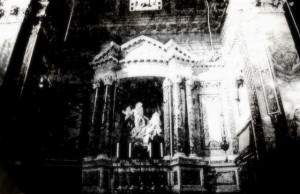
Plate 4: Gianlorenzo Bernini, Cornaro Chapel (1644 -1651), Rome, S. Maria della Vittoria.

Echeverría attributes an important role in this process to theatricality, another parallel with architectural Postmodernism and its enthusiasm for this device. It was not unreasonable, as an example, for the French architect Jean Nouvel to refer to Moore’s Piazza as «une scénographie de carton pâte, une farce de la ‘comedia[sic] della architettura’, un décor d’opérette») [a papier-mâché stage set, a farce out of the ‘commedia della architettura’, the scenery design for an operetta»] (*Note-12) .
In support of his argument, Echeverría cites the example of Gian Lorenzo Bernini’s Cornaro Chapel, created between 1644 and 1651 in the church of Santa Maria della Vittoria in Rome which with its spectators’ boxes and its dramatic lighting and staging has always evoked comparison with the theatre (*Note-13). The work of scholars such as Irving Lavin and Rudolf Preimesberger (*Note-14) has identified the numerous references, iconographies and pictorial formulae that Bernini employs here and which, so Echeverría maintains, he at the same time ironically subverts by allowing decoration to triumph over and thwart traditional forms of representation. Referring specifically to the issue of decoration, Echeverría writes:
«[…] how it contributes, its performance, differs from that of normal, non-absolute or non-Baroque decoration: it exaggerates, deconstructs, re-forms. The absolutely decorative manner in which the core or the essence of the Baroque work of art manifests itself does so in a way that does not deny that essence, it merely surmounts it; it does not annihilate, it transcends» (*Note-15).
And specifically referring to Bernini’s Cornaro Chapel he observes:
«The play of the folds […] sculpted by Bernini in St Teresa’s robes inserts a subtext into his depiction of the mystical experience that allows the sensual, physical and worldly aspects of such an experience unfettered by ascetic restraint to be revealed. In this (overstated) way, while not abandoning its Christian theme, the Cornaro Chapel in the church of Santa Maria della Vittoria in Rome, where the group sculpture including St Teresa can be seen, is unexpectedly transformed into the location of a pagan, even anti-Christian, aestheticisation of life» (*Note-16) .
In fact Bernini’s Chapel and in particular the sculptural group featuring Saint Teresa with the angel have often, not unreasonably, been accused of profanity. Around 1670 one anonymous observer remarked that the saint appeared to have been portrayed not simply as «prostrated» but also as «prostituted» (*Note-17), the same thought that was put into words some 70 years later by Charles de Brosses when he observed, «If this is divine love, I recognise it (*Note-18)»; and as Jacob Burckhardt put it rather more vehemently, «Certainly, all consideration of style is forgotten in the face of this shocking degradation of the supernatural» (*Note-19).
NOTES AND REFERENCES PAGE 4
12 – NOUVEL, Jean, Fragments: en différé … interview: en directs, in L’Architecture d’aujourd’hui 231 (1984), pp. 2-14, here p. 12.
13 – See e.g. LAVIN, Irving, Bernini and the unity of the visual arts, London and New York 1980, Vol. 1, pp. 77-140, in particular the chapter «Bernini and the theatre», pp. 146-157.
14 – PREIMESBERGER, Rudolf, Berninis Cappella Cornaro: eine Bild-Wort-Synthese des siebzehnten
15 – ECHEVERRÍA, Zum Baroque-Ansatz in Mexiko (see Note 11).
16 – Ibid.
17 – See LAVIN, Bernini (as Note 13), p. 121.
18 – BROSSES, Charles de, Lettres familières écrites d’Italie en 1739 & 1740, Paris 1929, Vol. 2, p. 703.
19 – BURCKHARDT, Jacob, Der Cicerone (Neudruck der Urausgabe), Stuttgart 1986, p. 671.
Burckhardt would probably have accused the painter Joan Costa, born in Valencia in 1952, of similar degradation. Costa, who could be described as a «Postmodernist par excellence», sees himself not only as someone working in the context of the «End of Art», a claim that he justifies through reference to publications on the subject by art historians including Arthur C. Danto, author of After the End of Art (published in 1997), but also using the historians’ analysis to provide himself with artistic resources and methods. As he writes, «[…] now that the History of Painting has reached its end, as Danto has explained in his book After the End of Art, the technique of copying has not simply returned to service, it has become fashionable under the name of ‘appropriation (*Note-20) ‘ (Appropriations is also the sub-title of a series of pictures by Costa, two examples of which are of particular interest in this regard).
Costa is expressing the same idea that has been a feature of Postmodernist architecture since the 1970s. Just as the explosion that demolished the modern(ist) Pruitt-Igoe showcase housing project in St. Louis, Missouri, at 3.32 p.m. on 15 July 1972 heralded the end of Modernism and the arrival of Postmodernism (*Note-21). Costa maintains, with Danto, «that the concept of modernity has lost all meaning» (*Note-22) . He therefore considers himself justified in liberating himself from its rules, similar to those imposed by architectural Modernism: insistence on innovation, including a strict prohibition on recourse to historic precedent, a ban on ornament and even restriction to «superior», worthy genres.
Freed from all of these constraints, Costa now sees himself in a situation where a very wide range of choices is again available to him that he sums up as follows: «Artistic themes previously disdained, an infinite variety of cultural and religious images, […] reworkings of all forms of literary, artistic and cinematic output, ornaments of authentically popular nature previously despised as vulgar – there is room for everything»(*Note-23). This extends beyond subject and content; he also sees the return of greater freedom in the choice of artistic techniques available: «The […] consequence is the lifting of the prohibition on all forms of language up until now deemed obsolete, traditional oil painting among them, that were kept shut away in the dim recesses of recent and not so recent History, enabling them to be brought back into service as a means of expression and rendered useful once again» (*Note-24).
NOTES AND REFERENCES PAGE 5
20 – See COSTA, Joan, Appropriations, http://www.joancosta.net/ – in Strong Women (2002- 2003) [29.10.2009].
21 – See in this regard JENCKS, The Language of Post-Modern Architecture (as Note 9), p. 9. Jencks several times defines the terms «modernist» and»modern», with very little terminological precision, as having the same meaning so that he can show that the Age of «Postmodernism» to be the legitimate successor to the Age of «Modernism».
22 – COSTA, Appropriations (as Note 20).
23 – Ibid.
24 – Ibid.
As a result, Costa now feels himself free once again, for example, to paint «with all the skill of a classical master», as attested by a fellow native of Valencia, the poet Josep Piera (*Note-25).
This Postmodernist emancipation extends beyond the availability of already existing genres and techniques, it also encompasses the more general approach that now allows Costa access to appropriate historical ideas and methods, enabling him to carry on the use of traditional practices and apply them to contemporary phenomena. He remarks on the sometimes absurd consequences this may lead to, referring to research by art historians (again) that has shown how the prostitute Lena was used by Caravaggio as his model for the Virgin Mary in several of his pictures (for example his Madonna dei Palafrenieri, in the Galleria Borghese (*Note-26) in Rome). Costa wonders why today another at first glance intensely secular woman should not lend her face to a saint.
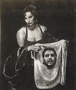
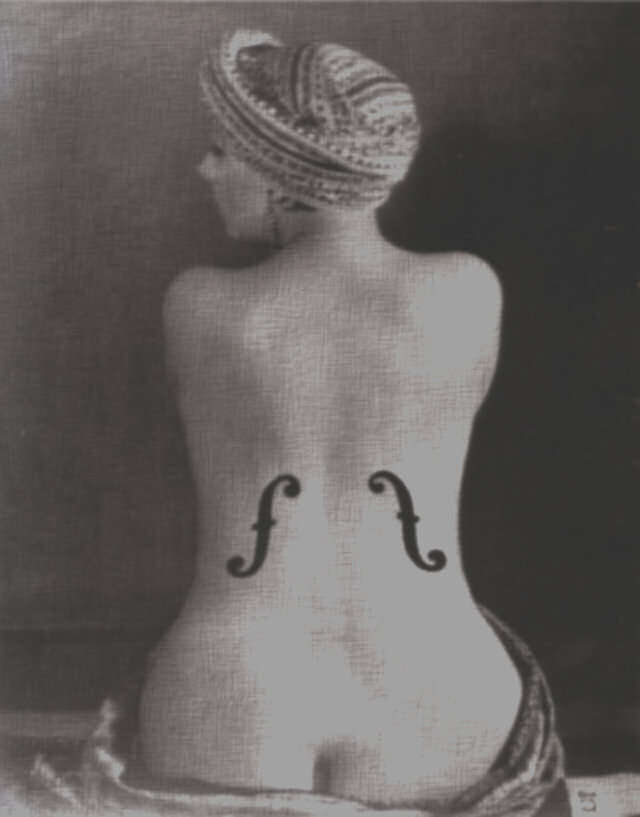
Plate 5:
Joan Costa, Verónica Taylor in red (2003),
Fundación Martínez Guerricabeitia, València (Spain).
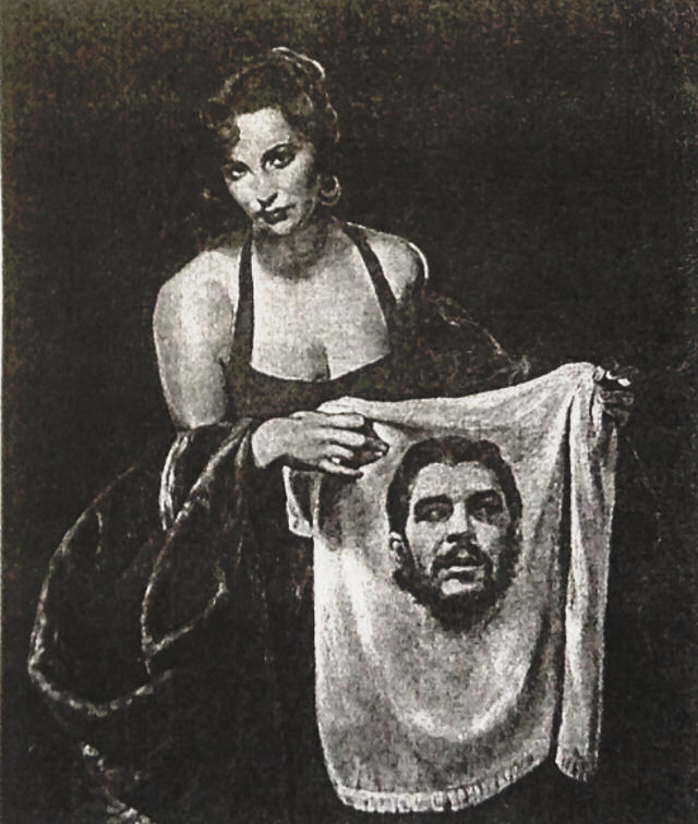
«Why then should Elizabeth Taylor not lend her face, via the medium of photography, to the personification of Veronica? This woman earned her living performing the same service in the context of a different art, that of the cinema. If she could be Cleopatra, why not Veronica as well?” (*Note-27).
Costa fails to mention here that in the works inspired by this insight, he was stylistically influenced less by Caravaggio himself than by the painting style of Simon Vouet…
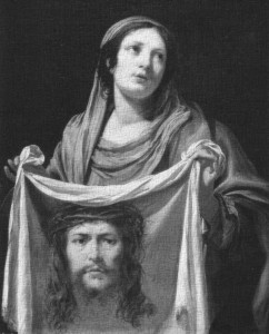
Plate 6: Simon Vouet, Sainte Véronique (2nd quarter of the 17th century),
Le Mans, Musée de Tessé. (*Note-28)

… the French artist who as a young man had been influenced by Caravaggio, or that his adaptations have extended to include the face revealed on Veronica’s cloth, which is no longer that of Jesus Christ but of another heroic figure of popular culture (*Note-29) and a modern icon of martyrdom (*Note-30), Che Guevara. This is the parallel deliberately chosen by Costa, as an example, between the way painters in the early modern period and the cinema approach the common task of choosing a model, in order to show how the «ornaments of authentically popular decoration previously despised as vulgar» that are his subject are now able to command the respect of artists once again.
NOTES AND REFERENCES PAGE 6
25 – PIERA, Josep, Joan Costa, pintor de mites / Joan Costa, pintor des mitos, in Les Dones Fortes. Apropiacones. Joan Costa, exhibition catalogue, Museo de Alicante 2008 (o. P.); for the English version quoted here see COSTA, Appropriations (as Note 20). Other similar exercises include work by the British artist David Hockney, who attempted in his Secret Knowledge: Rediscovering the Lost Techniques of the Old Masters (2001) to show how painters in the early modern era such as Caravaggio and Velazquez were already using methods of reproduction similar to those used later by their fellow-artists in the Modernist era – relativising and challenging the latter’s claims of radical innovation.
26 – COSTA, Appropriations (as Note 20): «Caravaggio helped the courtesan Lena become the Madonna of the Palafrenieri.» Costa is referring in particular to research by Jacob Hess stating that Lena posed as Caravaggio’s model for works including his Seven Acts of Charity, The Madonna of the Rosary and The Death of the Virgin. In this regard see in particular HESS, Jacob, Modelle e modelli del Caravaggio, in Commentari, V, Vol. IV, 1954, pp. 271-289, and CINOTTI, Mia and DELL’ACQUA, Gian Alberto, Michelangelo Merisi, detto Il Caravaggio. Tutte le opere, Bergamo 1983, pp. 216 and 499 (No. 48) and p. 524 (No. 60).
27 – COSTA, Appropriations (as Note 20).
28 – See COQUERY, Emmanuel, et al.., Figures de la passion, exhibition catalogue, Paris, Musée de la Musique, Paris 2001, p. 98, No. 11.
29 – On the subject of Che Guevara as a popular figure, see ANDERSON, Jon Lee, Che. Die Biographie., Munich 1997. Note also how for example how for the cover of her 2003 Album American Life the pop star Madonna adopted the aesthetic pose of the stylised image of Che Guevara produced by the Irish artist Jim Fitzpatrick in 1967 and derived from the original composition of Alberto Korda’s famous Guerrillero Heroico photograph.
30 – It is often remarked that pictures of the laid-out corpse of Che Guevara that was displayed to journalists after he was killed in 1967 bear a striking resemblance to artistic portrayals of the dead Christ (for example, Andrea Mantegna’s famous painting in the Brera Gallery in Milan) and have been described in the press as images of a modern saint who laid down his own life for a higher cause. See in this regard ANON., Che Guevara. A modern Saint and Sinner, in The Economist, 11.10.2007. It was not by chance that the songwriter Wolf Biermann in his 1976 song Comandante Che Guevara added a verse to his setting of a poem by Carlos Puebla in which Che Guevara is celebrated as «Christ with a gun».
The recreation and reworking of traditional iconographies or particularly well-known and appreciated works of art using a cast of celebrities drawn from the worlds of politics and popular entertainment is an approach familiar since the 1950s from magazine covers and record sleeves that satisfies the requirements of being both «authentically popular» and «previously despised as vulgar». Now that Modernistic disparagement of this kind has been rendered obsolete, this pastiche approach of «ennoblement» by reference to historical precedent has established itself as a strategy that Josep Piera has described as «baroque irony, as sophisticated as Pop» (*Note-31). Piera is referring not just to the Baroque practice, reclaimed by Costa as his own, of the unexpected choice of model, but also to the «old master» style, referenced again to the Baroque era, and its combination with icons from contemporary popular culture.

Plate 7a:
Jean-Auguste-Dominique Ingres,
La Grande Baigneuse (The Valpinçon Bather) (1808),
París, Louvre. (*Note-32)
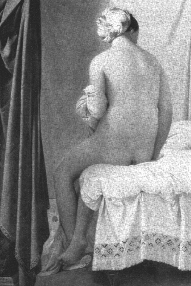
The element of «sophistication» is seen in the way that Costa reuses a method of working developed by other artists, carrying it forward and at the same time allowing it to return back to itself. An artist like Man Ray having legitimately reinterpreted the work of a «neo-Baroque» classicist such as Jean Auguste Dominique Ingres through the medium of photography (*Note-33), Costa takes photography – «now an icon or relic of the past» (*Note-34), as Piera observes, since the emergence of new artistic media such as video art – back to painting, by converting photographs by artists inspired by paintings, like Man Ray

Plate 7b:
Man Ray, Le Violon d’Ingres (1924) and Joel Peter Witkin
and Joel-Peter Witkin, who has himself gone back to Man Ray’s photographic images, to use them as the basis for his own works,
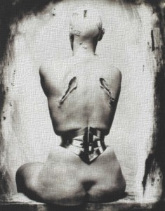
Plate 7c:
Joel-Peter Witkin, Woman once a Bird (1990). (*Note-35)
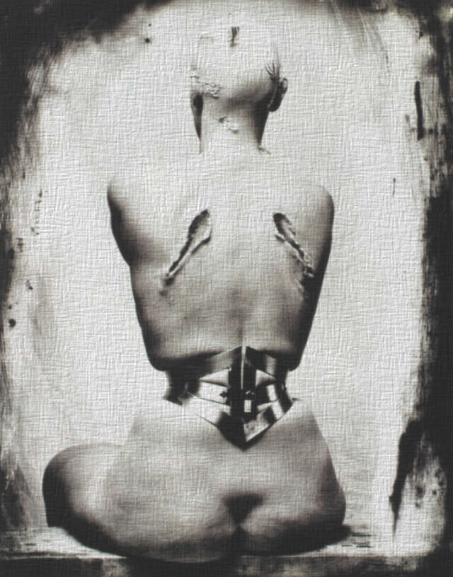
this time however recreating them through the medium of painting:

Plate 7d: JoanCosta,
Mujer pájaro/Volavérunt (2003),
Museo de la Universidad de Alicante.
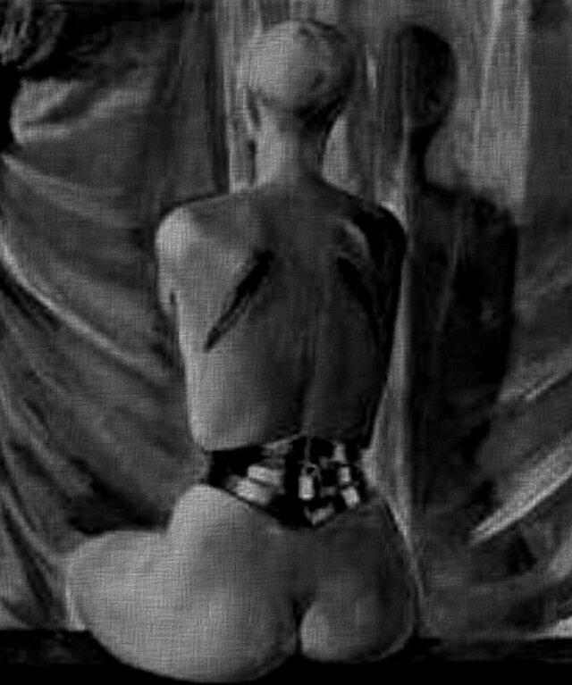
«Their photographs have been ‘translated’ into paintings, carried over into a different medium with the incorporation of colour. The meaning is intended to be different. We have here an itinerary of journeys to and from the territory of painting (*Note-36)«, with the aim, as Costa adds subsequently, to extract «new meanings from old images (*Note-37)«.
It is not by accident that in these «old images» Costa is referring directly (Caravaggio) and indirectly (Man Ray, Witkin) to the art of the Baroque, whose approach, as previously remarked, can sometimes be summed up in the three key concepts of «wit, reference, ornament».
NOTES AND REFERENCES PAGE 7
31 – PIERA, Joan Costa (see Note 25).
32 – Ingres saw himself in the tradition of painters such as Nicolas Poussin and Jacques-Louis David and sought to develop an increasingly close relationship between their motifs and those in his own pictures. On the subject of the picture reproduced here, La Grande Baigneuse (The Valpinçon Bather) (Paris, Louvre) of 1808, see VIGNE, Georges, Jean-Auguste-Dominique Ingres. Munich 1995, p. 69 et seq.
33 – On the subject of Man Ray’s photograph shown here, Le Violon d’Ingres (1924), see ibid., p. 70, also DE L’ECOTAIS, Emmanuelle, and SAYAG, Alain, Man Ray – Das photographische Werk , Munich, Paris and London 1998, p. 137 and p. 254.
34 – PIERA, Joan Costa (as Note 25).
35 – In the photograph reproduced here, Woman once a Bird (1990), Witkin takes motifs from Man Ray’s Le Violon d’Ingres, for example, the rear view of the naked woman and the sound-holes on her body, and reworks them in the picture of a (bird-)woman whose wings have been amputated. See in this regard WITKIN, Joel-Peter and BORHAN, Pierre, Disciple & Master. New York 2000.
36 – COSTA, Approprations (as Note 20).
37 – Ibid.
The writer Michael Gruber has produced his own interesting narrative interpretation of these ideas, in his novel The Forgery of Venus (2008) (*Note-38). Gruber’s book is written in the form of an autobiographical account given by the artist Charles (Chaz) P. Wilmot Junior on a CD to the first person narrator of the story in order to explain why, very shortly beforehand, he had described a newly-discovered painting by Velazquez as a «fake» because it was a work apparently painted in 1650 by himself and not by the Spanish artist in Rome (*Note-39). In fact, a few pages earlier the reader has found out that Wilmot is able to paint in the style of Velazquez: «I can paint like Velázquez. I can paint like anybody except me «(*Note-40), Wilmot declares, revealing himself in some respects a worthy son of his father, the financially and socially much more successful painter Charles P. Wilmot Senior, «at one time considered the natural heir to the throne occupied by Norman Rockwell»(*Note-41).
He already possessed the ability to paint in the style of various old masters which he put to use for personal purposes on the one hand (for example painting his wife in a range of different styles, «from Pre-Raphaelite sylph […], to classical Venus, to the Titian version, finally to Rubens *(Note-42)», and on the other, to paint a Second World War scene of a group of gunners on an aircraft carrier watching a Kamikaze pilot flying straight towards them: «[…] the interesting thing about the picture is that one of the crew, a boy really, has turned away from the oncoming doom and is facing the viewer […] with an expression on his face that is right out of Goya […]. In fact, the whole painting is […] a modern take on his famous ‘The Shooting[s] of May Third 1808‘ (*Note-43)«. However, unlike his son Chaz, who is to a large extent dependent on adaptations of this kind for his living, the father, otherwise a highly successful artist, had no success with this work «and the painting remained unsold» (*Note-44) .
In this way Gruber makes it clear that behind the use of the old master style by both father and son is a conscious opposition to Modernism’s insistence on innovation and to the decline of contemporary art that this has led to: «I still can’t quite believe that it’s all gurgled down to the nothing that it looks like now», is how Chaz sums up its dismal condition, providing specific illustrations tacitly suggestive of the work of artists such as Jeff Koons, Martin Kippenberger, Damien Hirst and Andreas Slominski: «big kitsch statues of cartoon characters, and wallpaper and jukeboxes, and pickled corpses, and piles of dry-cleaning bags in the corner of a white room […]» (*Note-45) .
The language suggesting the draining away of a current («all gurgled down») links this passage to the view of the art historian Kenneth Clark, shared by both father and son, that for the artist there must be a way of resisting the «relentless flood of innovation»:
NOTES AND REFERENCES PAGE 8
38 – GRUBER, Michael, The Forgery of Venus. A Novel, New York 2009. As Gruber has stated in an e-mail to the author dated 19.10.2009, his novel does not refer to any specific artist.
39 – GRUBER, The Forgery (as Note 38), p. 11.
40 – Ibid., p. 7.
41 – Ibid., p. 3.
42 – Ibid., p. 18.
43 – Ibid., p. 9.
44 – Ibid.
45 – Ibid., p. 16.
«There has to be some way of not being swamped in the ruthless torrent of innovation, as Kenneth Clark called it. As my father was always saying (*Note-46)«.
Chaz and his father – like Costa (*Note-47) – see a deliberate return to the past and the styles it has to offer as a way of escaping Modernism’s artistically destructive insistence on unrelenting innovation. While the father follows this path for his personal purposes only or in the context of what we have seen to be an unsuccessful and therefore unrepeated experiment, his son has chosen it as the way to earning his living, not in the world of ‘fine’ art but in the ‘inferior’ medium of cover illustrations, for example a commission to celebrate the marriage of New York Mayor Rudolph Giuliani with an adaptation of Jan van Eyck’s Arnolfini Wedding. Charles makes it clear enough that this is not the right area for him to be working in, because his work is not appreciated and commissions of this kind involve an excessive and ultimately uneconomic expenditure of time and effort. Instead of doing what other artists do and using computer software like Photoshop or simply doing the absolute minimum required to produce a cover illustration, Wilmot works to standards of his own, that even apply to the materials that he uses: «I did that, in oils on real oak panel just like the original» (*Note-48). This allows him to experience a sense of satisfaction with the finished work : «It was a real painting, not a cartoon, and it had some of the authority of the original» (*Note-49).
However the quality of his workmanship is not acknowledged or respected by his contemporaries, because of the demand for innovation specified and imposed by Modernism: «[…] I can do something extremely well that has absolutely no exchange value as artwork. People can see that quality in the old masters, or at least they write about seeing it, but not in something made yesterday» (*Note-50).
The fact that workmanship of this standard may also be a source of insight and for that very reason unwelcome in certain contemporary milieux is made clear when Chaz receives another editorial commission. He is asked to produce a «series of articles on the great beauties of the day illustrated by portraits painted in oil in the manner of the great masters» for Vanity Fair (*Note-51). Significantly, four of the five old masters are 17th or 18th century artists or, like Ingres, significantly influenced by the Baroque style: it is only the pop star Madonna who is to be painted in the style of a Renaissance artist, the others (Cate Blanchett, Jennifer Lopez, Gwyneth Paltrow and Kate Winslett) are to be portrayed in the style of Gainsborough, Goya, Ingres and Velazquez.
NOTES AND REFERENCES PAGE 9
46 – Ibid., p. 17. The expression «ruthless torrent of innovation» is taken from a sentence in Kenneth Clark’s The Nude, first published in 1956 – see CLARK, Kenneth, The Nude, London 1960, p. 355: «Almost alone of the generation succeeding Picasso, he [Henry Moore] has now felt himself swamped or frustrated by that ruthless torrent of innovation.»
47 – See in this regard Costa’s critique of Modernism’s pressure to innovate: «the artistic onus imposed by the inanity and futility of the notion of ‘the new’ in art, the need to contrive a constant succession of formal innovations (styles, as we used to call them) – […] the tyranny of everything that proclaimed itself to be new or simply modern.» See COSTA, Appropriations (as Note 20).
48 – GRUBER, The Forgery (see Note 38), p. 46.
49 – Ibid.
50 – Ibid., p. 67 et seq.
51 – Ibid., p. 49.
The original inspiration for the series, as Chaz himself disparagingly observes, is Peter Webber’s 2003 film The Girl with a Pearl Earring, featuring the actor Scarlett Johansson as «Griet», the subject of Jan Vermeer’s painting (*Note-52). Nevertheless the commission is a meaningful one for Wilmot because, as he argues, in his own defence (and almost paraphrasing Costa), «I don’t see what the difference is between that and painting princesses in the seventeenth century […]» (*Note-53).
Where that difference in fact lies Wilmot discovers after he delivers the pictures, having (as Gruber’s detailed description of the Madonna portrait suggests (*Note-54)) very clearly (again, like Costa) conceived of them as character portraits and worked them up from photographs. They are rejected by the client as «too spooky and weird», on the grounds that «they didn’t look enough like the stars». Wilmot vigorously disputes this evaluation, observing that «they looked exactly like the stars» and adding as his conclusive argument, «as those stars would be seen by the five old masters concerned»(*Note-55). What he actually means by this is made clear again towards the end of the novel as the first-person narrator expresses his opinion of a portrait of himself that Chaz Wilmot has painted, again, of course, in the form of a historical character portrait («He’d dress me in the clothes of a Spanish grandee of the seventeenth century, just like Velázquez used to do»(*Note-56)): «It’s terrific. Full of life. More of me than I like to see revealed, frankly.» As the discussion with the publisher and editorial staff of Vanity Fair makes clear, Wilmot’s specific problem is that the historical style of the five old masters offers a penetrating and insightful glimpse of the stars, who appear strange because they are anachronistic:
«[…] what it turned out to be was they really had no idea that anyone had ever seen things differently from the way they do now. They thought that the current view of everything was the stone reality, that this week stood for all time. And I guess if you’re running a style magazine with cultural pretensions, that’s the way you have to see the world. […] If people looked and thought deeply they wouldn’t read magazines or at least not magazines like ‘Vanity Fair’ (*Note-57)«.
So here we have an attitude very similar to Costa’s own: Modernism, with its insistence on innovation and its proscription of certain artistic forms and practices, has failed and come to a stop, and so both of these two, Costa and Wilmot, are now appealing to the authority of the art historian (Arthur C. Danto in one case, Kenneth Clark in the other), to absolve them for having rejected its demands and denials. In looking to the history of art for justification in this way, they are turning their backs on Modernism (in Wilmot’s case also seen as being technically undemanding and theoretically unconvincing) in order to return to the techniques and motifs of the past.
NOTES AND REFERENCES PAGE 10
54 – Ibid., pp. 58-60.
55 – Ibid., p. 67.
56 – Ibid., p. 312.
57 – Ibid., p. 67.
In Wilmot’s case, however, this about-turn takes on an extreme and almost fantastic aspect as the effects of an experiment with medicinal drugs cause the painter to experience the sensation of having apparently swapped bodies temporarily, across time and space, with Diego Velazquez himself, in the 17th century. This, we see, is the explanation not just for Chaz’s earlier opinion that he had painted the picture now judged to be a work of Velazquez in Rome in 1650 (a «fake», as it were, to the extent that it is not a [entirely] genuine Velazquez) but also, the novel suggests, the reason why the modernistic characteristics (composition and various individual elements (*Note-58) ) of Las Meninas, painted in 1656, might be attributable to the influence of repeated body-swaps between Wilmot and Velazquez on the Spanish artist’s work.
In direct contrast to Costa and Wilmot with their photograph-based paintings and stylistic adaptations, the 1935-born native New Yorker, performance and installation artist and film maker Eleanor Antin chose to proceed in a completely opposite direction in her 2004 translation of Nicolas Poussin’s painting The Triumph of Pan …
 Plata 8:
Nicolas Poussin,
Triumph of Pan (C. 1636),
London, National Gallery.
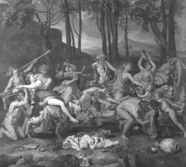
… into a photographic tableau vivant, slightly enlarged compared with the original …
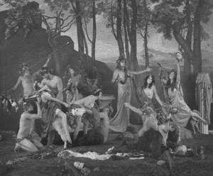
Plate 9:
Eleanor Antin, The Ttriumph of Pan (after Poussin) (2004).
… Poussin’s picture, now displayed in the National Gallery in London, measures 134 x 145 cm whereas Antin’s photograph measures 153.7 x 184.2 cm, so the enlargement is mainly in the horizontal plane (*Note-59). Nevertheless she too sees her interpretation as a type of return to the original, her object in translating what is taking place within the picture with the help of a cast of actors being to draw attention to the way in which Poussin used a small model theatre to work out his compositions, moving model figures around its stage in order to try out different organisational and lighting arrangements. Antin makes use of live actors instead of small model figures (*Note-60) before, like Poussin, she records the final result on a permanent basis, not by drawing and painting in oil, but with the help of photography, in the attempt to renew and recreate the picture (she herself ambiguously uses the expression «to re-construct» (*Note-61), which also suggests that she begins by deconstructing Poussin’s composition before proceeding to put it back together again – to reconstruct it).
In fact Antin has not recreated Poussin’s picture 100% faithfully. Her work differs increasingly from Poussin’s original across the right-hand half of the picture: in Antin’s version Pan is no armless statue, he is a living, active person, while the figures to the right of him adopt poses and gestures that are different from those of Poussin’s figures and Antin has even omitted part of the group of cavorting young Bacchantes on the right side of the picture. The effect of all this is to suggest that in Antin’s composition the disinhibiting god Pan seems to be attempting to free the scene from the shackle of a rigorously accurate reproduction of the Poussin painting and turn it into a «fakery of the copy as parody» (*Note-62).
NOTES AND REFERENCES PAGE 11
58 – See for example Ibid., p. 24: «[…] there wouldn’t be anything like the blurred treatment of the lady dwarf until the twentieth, it was like something out of de Kooning or Francis Bacon. […] the two attendant meninas, one superbly painted like her mistress, the other blocked in angular planes like […] a little Cézanne avant la lettre […].»
59 – On the subject of Poussin’s painting, see VERDI, Richard, Nicolas Poussin 1594-1665, London, Royal Academy of Arts, London 1995, p. 202 – 204, No. 29; on the subject of Antin’s interpretation, see Eleanor Antin: Historical Takes, Exhibition catalogue. San Diego Museum of Art. Munich, Berlin, London and New York 2008, p. 57.
60 – See in this regard HERTZ, Betti-Sue, Eleanor Antin’s Transpositions. A feminist view of academic painting in the age of digital photography, in ANTIN, Historical Takes (see Note 59), pp. 81- 91, here p. 88.
61 – e-mail to the author dated 24.7.2008: «In my ancient Greek and Roman series, I like to occasionally ‘re-construct’ a particular painting that engages me.»
Antin is also attempting to bring the original up to date in two different ways. Firstly, as she remarks:
«[…] I thought that in some way, his [Poussin’s] ‘Triumph’ evoked the erotic (and absurd) landscape of my own Southern California»(*Note-63).
She also recounts how the backdrop was painted using reproductions taken from old art history books, all of them printed from the same, usually cropped, Ektachrome museum transparency (*Note-64), so that Antin’s photograph is also a reflection on the «mediality» of reproductions of works of art. Antin emphasises the fact that this Ektachrome transparency which served as the basis for her work was «old fashioned», «poorly done» and «cropped» (*Note-65), and in this way she is also trying to say that the medium through which it is being «returned» is not photography but painting, a category that she generally considers to be a «historical ruin» (*Note-66).
Finally, the Philadelphia-born and raised artist Natalie Charkow also seeks to foster a dialogue between Poussin’s original paintings and drawings and their printed reproductions: although trained and continuing to work as a sculptor, she says that following a period spent creating three-dimensional figurative and abstract sculptures, she subsequently became attracted to paintings and drawings in particular, entering into a dialogue with both the originals (initially) and their reproductions (subsequently):
«I realized what I liked best was […] having what I call a long ‘conversation’ with the work in question, since during the work in progress I repeatedly refer to reproductions of the images» (*Note-67).
NOTES AND REFERENCES PAGE 12
62 – HERTZ, Transpositions (as Note 60), p. 88.
63 – e-mail to the author dated 24.7.2008.
64 – Ibid.: «Also, we had to paint the drop from small, lousy reproductions in old art history books so the color varied, often considerably, from book to book, even though they often used the same, old fashioned, poorly done (and cropped) slide from the host museum […].»
65 – Ibid.
66 – Impossible Facts – Max Kozloff interviews Eleanor Antin. In ANTIN, Historical Takes (as Note 59), pp. 76-79, here p.76: «Eleanor Antin: Painting is pretty much a historical ruin.» The wording is reminiscent of Costa’s description of photography, quoted above, as «now an icon or relic of the past» – see COSTA, Approprations (see Note 20).
67 – e-mail to the author dated 18.7.2008.
In the reliefs that have resulted from this, she combines graphic and sculptural, abstract and figurative elements; she is less interested in the specific treatment or the iconography of the original composition than she is in their construction, structure and spatial organisation – or, as the writer John Hollander observed in a commentary on Charkow’s work,
«The sculptor’s imagination does not ask ‘Who are these figures?’ but rather ‘Where are they’ – ‘How, structurally, spatially, are they there?’ (*Note-68)«.
It is precisely this interest in abstract, stereometric structures to which the artist is attracted in Poussin, whose works she sees as characterised above all by «order and logic» (*Note-69), and which she has therefore chosen not for their subject matter but on the basis of a specific use of proportion, in a dialogue with the artist that has lasted for more than 40 years.
Accordingly the relief Parnassus (After Poussin), first created in 1962 (in limestone and bronze, and reproduced in a series of replicas from 1980 onwards (*Note-70) ) – Charkow’s first dialogue with the artist – was based, again, not on Poussin’s finished coloured painting in the Prado in Madrid (*Note-71), but on the preliminary sketch with its more abstract appearing lines and monochromality (Malibu, The J. Paul Getty Museum (*Note-72) ), that Charkow saw at the L’Ideale Classico del Seicento in Italia exhibition in Bologna in 1962 (in terms of size her interpretation is somewhere between the larger painting (145 x 197 cm) and the smaller drawing). It was only in later works such as her Twelve Mythological Views (After Poussin) of 1999 that the artist used finished pictures as the basis for some of now miniaturised interpretations of Poussin’s compositions, almost exclusively works produced by the painter in the 1620s and 1630s with the exception of the 1642 sketch «Scipio and the Pirates«, significantly executed by Poussin as a drawing only (*Note-73).
Plate 10:
Natalie Charkow, Twelve Mythological Views (After Poussin) – 1999.

Unlike Antin, Charkow – «ironically» as Hollander puts it (*Note-74) – only became aware very much later of the existence of Poussin’s miniature theatre, although it appears to have as close an affinity with Charkow’s «boxes of figures» as it does with the «tableaux vivants» of Antin’s photographs. However her creations, reminiscent of «cabinets of miniatures», include knowing references to the fact that time and again Poussin found inspiration in the study of ancient sarcophagus reliefs. Charkow, too, historicises Poussin’s works in a variety of ways. Firstly, in her technique, style and type of subject she returns to her sources of inspiration; however these are not evoked through the the unmodfied model, but through a form and style suggestive of reliefs from antiquity that the ravages of time have eroded and worn down to their basic outline. Secondly the finished versions of the artist’s compositions differ in size from the original models. They are assembled together in a way that resembles the cabinets of miniatures of the past, as a fragmentary and chronologically incoherent collection of the artist’s works (in this regard not unlike the cabinets of miniatures produced by Johann Valentin Prehn, the creator of a bourgeois miniaturised version of the great Baroque picture collections.
NOTES AND REFERENCES PAGE 13
68 – HOLLANDER, John Introductory Note. In Natalie Charkow. Sculpture. New York, Robert Schoelkopf Gallery 2001, (o. P.) [p. 1].
69 – e-mail to the author dated 18.7.2008.
70 – See HOLLANDER, Introductory Note (see Note 68) and the detailed examination in the list of «Works in the Exhibition».
71 – ROSENBERG, Pierre, and PRAT, Louis-Antoine, Exhibition Catalogue. Nicolas Poussin. Paris 1994, p. 206 et seq., No. 45.
72 – Ibid., 161, No. 20.
73 – Ibid., 309, No. 106.
74 – HOLLANDER, Introductory Note (see *Note 68).
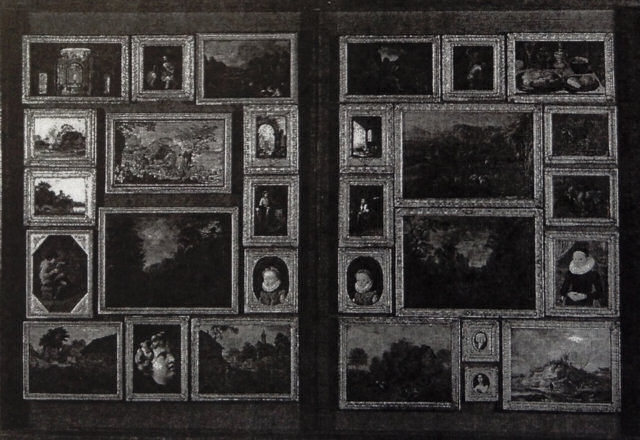
Plate 11: Cabinet of miniatures by Johann Valentin Prehn (1780/1821), Historisches Museum, Frankfurt am Main) (*Note-75)
Finally the format and framing of Charkow’s miniature picture displays also recalls the typical format of the small-format transparency – now itself almost relegated to history as a way of representing works of art. Looking back over the examples given here, it is clear that in addition to their recourse to the art and methods of the Baroque era, the various works also share a common purpose, in that all appear to use these specifically as a means of referencing themselves to an earlier period of history and at the same time liberating themselves from the aesthetic rules governing their own present. It is no accident, then, that the period of history they have chosen to make use of is the Baroque, an era whose philosophical approach, characterised by a combination of reference and irony, appears to ensure the correct balance between a necessary freedom («Irony as an artistic style aspires to a state of indecisive hovering ending with the creation of a form with intrinsic value, […] an aesthetic construct in an aesthetic context», was how Hankamer referred to «Baroque irony» (*Note-76) ) and the desire to engage with the past. At the same time it serves as an ideal, and in that respect is like a mirror that can be as far away or as close as necessary – or, as Mieke Bal observed in 1999, the Baroque is not so much a style as a point of view or a way of thinking, «which first flourished during a specific period and now functions as a point of convergence whose traffic control signals force us to halt and stop to think about the (culture of) the present and (some aspects of) the past» (*Note-77).
NOTES AND REFERENCES PAGE 14
75 – See SCHMIDT-LINSENHOFF, Victoria, and WETTENGL, Kurt, Bürgerliche Sammlungen in Frankfurt 1700-1830, Frankfurt am Main 1988.
76 – HANKAMER, Deutsche Gegenreformation (as Note 1), p. 271.
77 – BAL, Mieke, Quoting Caravaggio: Contemporary Art, Preposterous History. Chicago 1999, 16. –